2024
JUGGLE: Family-Friendly University App
A research-led mobile app supporting mature students balancing study and parental responsibilities.
UX RESEARCH • INTERACTION DESIGN • PRODUCT DESIGN
A walkthrough of the JUGGLE prototype, showing the MVP Study & Play booking journey and check-in option.
Overview
JUGGLE is a mobile app concept designed around the needs of mature students with parental responsibilities. Research highlighted the challenges of balancing university study with family life, particularly when caring responsibilities overlap with time spent on campus.
The MVP focuses on a booking system for family-friendly campus spaces where children can play while their parent studies or works with classmates nearby. The concept was designed to bring university and family life together, making it easier for students with parental responsibilities to participate in campus life without having to separate the two.
Research & Design Process
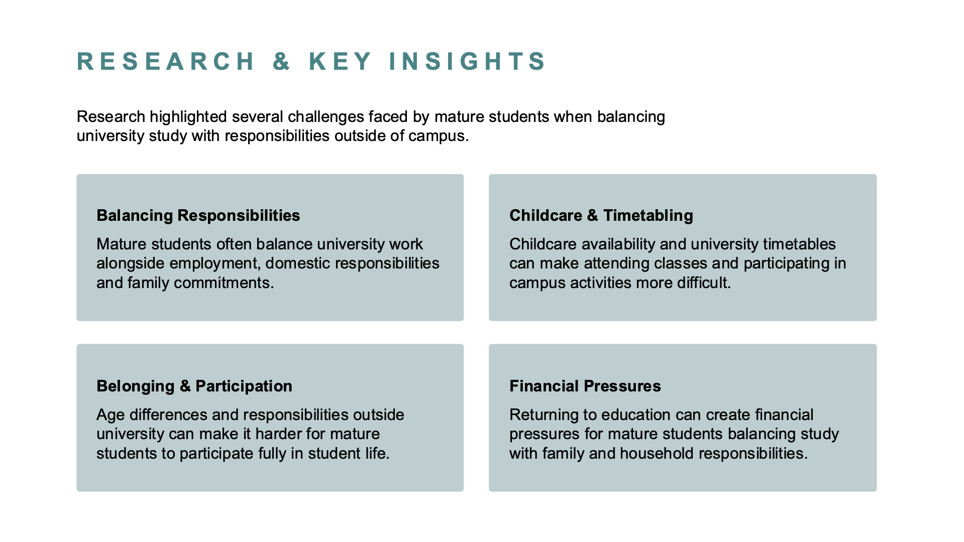
Research into the experiences of mature students highlighted recurring challenges around childcare, timetabling, finances and participation in university life. These insights helped define the priorities and requirements that guided the design process.
Build & Strategy
The wider JUGGLE concept explored how a university app could better support students with parental responsibilities, making university services and campus life more accessible around family commitments.
For the MVP, I focused on Study & Play: a booking system for family-friendly spaces on campus where children can play while their parent studies or works with classmates nearby.
I mapped the booking journey and developed the experience from early wireframes into a high-fidelity Figma prototype, designing the interactions and information needed to find a suitable space, make a booking and access it afterwards.
User feedback highlighted issues with navigation, visibility and interaction. I used these findings to refine elements including the login button, navigation and booking controls, creating a clearer and more usable final experience.
Reflection
This project strengthened my understanding of how research can shape the direction of a digital product, from identifying a meaningful problem through to defining and testing a focused solution. It also reinforced the value of designing around the wider context of people’s lives, rather than treating individual interactions or features in isolation.
Links